If you want stunning rooms, create eye-catching features that are both interesting and dramatic.
The main feature of a room could be a wall with a TV, or fireplace, or both. It might also include shelves and other features. In some instances, a wall is “featured” by simply making it a different color from the rest, just to be unique.
Anyone who thinks they designed a feature wall, by only adding a fireplace, and then stops, without further planning, is being negligent.
The total scope involves designing all parts of the whole wall, and there’s a lot to consider.
For example, will paintings hang on the wall? How many? What sizes should they be? Will lighting highlight the paintings? Will there be shelves or a television? If so, where and what size? Don’t forget to also plan all electrical recept locations.
Technical Features are more than decorating.
We consider many things when designing house plans. Sometimes, the line between decorating and drawing blueprints tends to blur. It may seem like the work of interior decorators.
However, the design of a wall’s features tends to be more than on the surface. So, we draw plans for it. And that’s really the reason why it is more than mere decorating.
But here’s the thing, as important as feature walls are, I’m not giving you a long list of ideas here, because that’s not what you need.
What you need is to grasp is the psychology behind why feature walls are important, and then the tactics for how to use that psychology in your own designs.
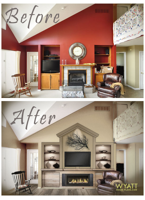
To help you, I’ll walk you through the project we designed (above).
The Challenges
Viewing the TV.
The first goal of this project was to create a comfortable viewing height for the television above a fireplace.
But the problem was the old-style fireplace was tall. Plus, a TV has to be high enough for fireplace heat dissipation. Making matters worse, the fireplace sat atop a raised hearth. So, all told, a TV above the old fireplace would be too high.
Well, it would be great when standing, but not so good when sitting.
Steps to the Solution
Step 1. Height Reduction
After removing the raised hearth, we planned around a new, lower-profile fireplace. This brought the height down a lot. Plus, the new, wide fireplace prevents the television from appearing top-heavy and teetering above it.
But we still had to deal with the heat from the fireplace. So, we used a non-combustible concrete-based mantle. That was the final step in getting the TV to a good viewing height.
Step 2. Study the Aesthetics.
Of course, to start, one needs to know how much space they have to work with. How wide and tall is the wall space?
In this step we look at the overall aesthetics of the featured wall. We identify what seems oddly shaped or badly proportioned. This assessment helps determine what draws our eye from the main feature. Then we contemplate how to make the main feature dominate so that it holds our attention.
It is vital to step back, see the whole wall, and identify all parts of the wall. This is essential in designing them so they fit and flow together.
STEP 3. Deal with Mass
Having identified odd shapes or bad proportions, we contemplate how to rework the wall and make it dramatic.
In this room, the upper wall not only appeared top-heavy, but it was a strange shape. To break up the upper wall mass, we added a geometric, architectural detail that resembles a roof peak. However, that does not solve everything. The geometric feature needs broke up even further, which we will accomplish with the irregular shapes of tree branches and twigs. They are a perfect way to break up the wall space. Besides, natural shapes contrast the boxy shelves, TV, and fireplace.
STEP 4. Remove Thin Walls
We also noted that walls to the left and right sides of the original shelves seem too thin to support the massive upper wall. To avoid using thin walls that appear unable to support a lot above them, we thickened the walls. Thick walls, in contrast, are robust and show strength.
Step 5. Connect everything with a complementary, somewhat monochromatic color pallet.
With the initial goals achieved, we could now focus on connecting all the parts, using a complementary color pallet to bring it all together for a united, cohesive appearance.
The variety of colors were toned down. We used tones of a similar color for more harmony and unity. With a more neutral color pallet, the eye doesn’t jump from to red walls, to orange cabinets, to gray tiles. It rests right in the center of the wall features… the TV and fireplace, but we had another problem to deal with. The upper wall seemed massive. So, we use twigs and tree branches to cut the space.
Twigs and Tree Branches Are Great.
We live in a world inside our homes that is most unnatural. Rooms are generally square and boxy.
Nature, on the other hand, is random. Tree branches, for example, are irregular. They twist and turn and may have secondary, smaller branches going different directions.
This makes them ideal for breaking-up boxy interiors and solid walls, as we did in the example above. Twigs and tree branches can do a lot for your home decor, especially featured walls.
In the above photo, curly willow branches are tall enough to help balance other tall things in the room. (house plan SH-11010)
The challenge with any tall space is how to fill the space. Although a niche shelf (photo below) is raised 36 inches above the floor, the vertical space from there up needs attention. Short pieces of pottery are not adequate, but curly willow branches help to fill the tall entry niche area. (house plan SO-05001)

How to Fill a Large Niche
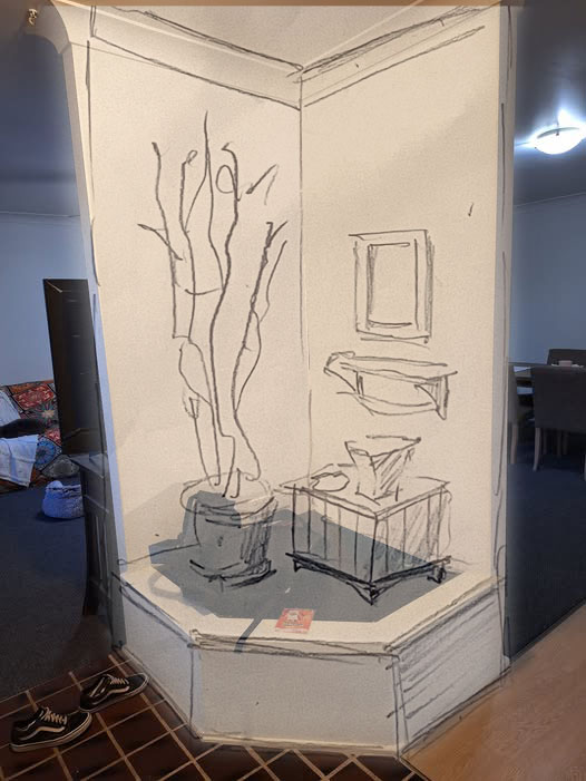
Grab some tracing paper… many great ideas start with a sketch!
Not shown in the sketch (above), but intended for its dramatic effect, adding an up-light behind the twigs and branches will cast intriguing shadows on walls and ceiling. Plus, it can be used after dark as a gentle nightlight.
For realism, that the above sketch fails to capture, here’s a real photo of curly willow branches in a vases.
The five vases look great set in a row along a long wall, but only one for the corner niche sketch would be enough.

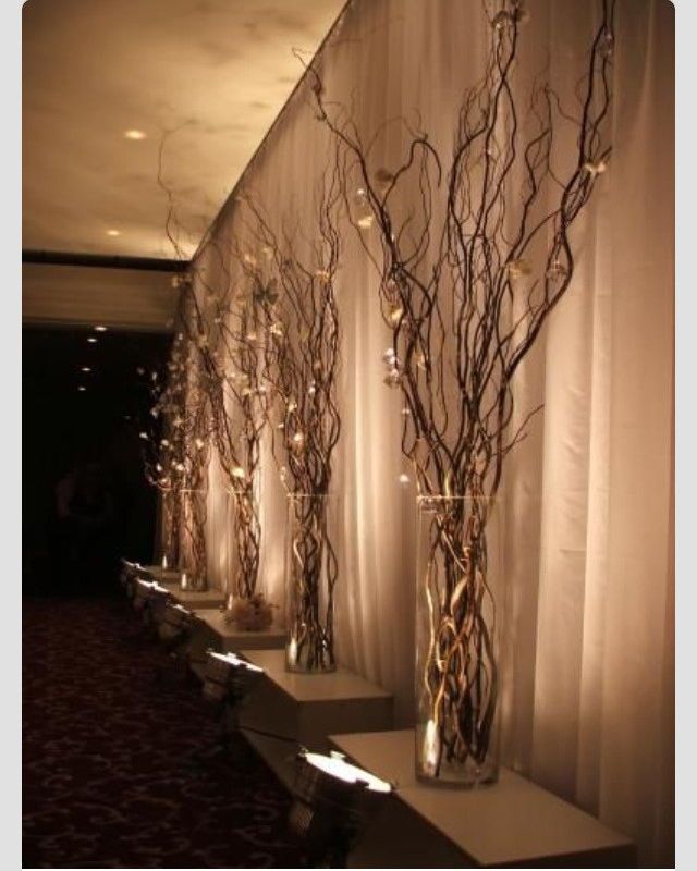
Another lighting example (above) from Pinterest.com, the white branches contrast a dark wall for a bold, eye-catching accent.
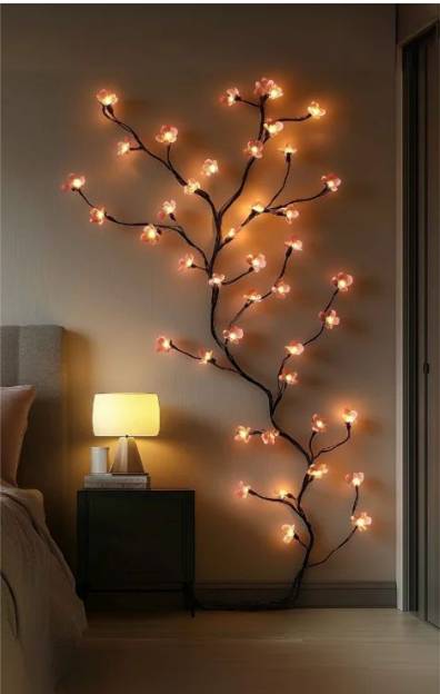
All Parts Matter
Consider what each item offers to the whole. For example, without the lamp, small table, and bed (above photo), the dynamic would change completely. The tree of lights would seem rather lonely.
We consider so many details!
See more examples: DETAILS ARE IMPORTANT